Introduction

Prints
Jasper Johns, now 91, is known for artwork about everyday things like maps, targets, flags, light bulbs and beer cans, or, as Johns famously put it, “things the mind already knows.” Johns describes his approach to art as "Take an object. Do something to it. Do something else to it. (Repeat)." Of course, there is much more to this easy to remember formula. There is a distinct sense of poetry in the work of Jasper Johns as he addresses love, heartbreak, nostalgia, and mortality in a kind of internal archaeology where these everyday objects take on a totemic importance that come in recursive refrains. Often this recursive approach comes through mirror images of previous work along with a layering of older motifs alongside newer ones. In a sense, this mirrors the way the mind works as it returns to a categorical inventory, shorthand summaries of life embodied in objects we find personally cogent. What ties all of his work together is the importance of memory in a meaningful life, specifically visual memory. Johns wants us to look at the world more actively, to look at the familiar and to look at it again more carefully as a way of being truly alive. The prints in the first gallery are an excellent overview of this methodology and an unusual way to begin a retrospective like this. Rather than a large wall-spanning painting, the viewer takes in a series of small prints that serve as a preview of his entire career. It is also appropriate because printmaking is central to Johns, who does not see prints as being a lower order in the hierarchy of his work. They are a stunning testimony to his creativity and are so varied that they do not look like the work of one individual.
This show is very large, grab a seat if you need to. There is also a lot of talk about symbols and motifs but you can also just enjoy the work aesthetically: Johns is a master of design and texture, his work is beautiful and he actually would prefer that it be appreciated that way with the references unclear and their mystery part of the experience.
Disappearance and Negation

Target with Four Faces, 1955
Jasper Johns moved to New York in the summer of 1953 after being discharged from the Army in South Carolina. In 1954 Johns destroyed all of his work as a way of reinventing himself, and he decided that repressing emotion as much as possible was more sophisticated, more adult, and also created distance from the work of the Abstract Expressionists. He purposely removed elements from his work that reminded him of work other artists around him were doing. A few months after his arrival in New York he met Robert Rauschenberg who Johns described as “the first person I knew who was a real artist.” Johns and Rauschenberg began a creative and romantic relationship that they shared with another couple, the composer John Cage and his boyfriend, the dancer and choreographer, Merce Cunningham. Cunningham and Cage were both inspired by aesthetic possibilities of chance, which made a profound impression on Johns. Like Johns, Rauschenberg explored work that was very much rooted in themes of the everyday in a way that seemed almost impersonal. Target with Four Faces appropriates a readymade image, a target, and incorporates a row of impassive faces which seem to embody his attempt at policing his own emotions. The plaster faces seem vulnerable but unconcerned, located just above a target, a feeling that is heightened by the fact that they are blinded and unable to anticipate or avoid an errant shot. The faces are not only eyeless, there is also a hinged lid which could hide them and potentially protect them if closed. The vulnerability of the faces speaks to something more personal and psychologically fraught, something more in line with the Abstract Expressionists than art historical tropes would allow for. Johns had planned to put panels on top of the work like piano keys that viewers could press to create sounds, drawing them closer to the work in a multimedia experience. Other early works in the same gallery, many largely gray, speak to the sadness of negation, of impulses concealed and purposeful blotting out as a form of hopelessness. Diver is thought to be an image of suicide related to the poet Hart Crane who jumped off a boat, reportedly after having flirted with a sailor and not having his advances reciprocated. Johns painted Target with Four Faces in 1955, the same miraculous year that he painted the first of his flag paintings, which we will see in the next gallery.
Flags and Maps

White Flag, 1955
Johns said that one night in 1954 “I dreamed that I painted a large American flag, and the next morning I got up and I went out and bought the materials to begin it. And I did.” Johns has long been drawn to images seen in dreams, things he briefly sees from the window of a speeding car, concrete imagery grasped from fleeting sources. Johns has always insisted there is no political content in the flag paintings, he simply dreamed about painting a flag and set about doing that when he woke up. The idea here is to look at the flag as an object: to really see it, not as a symbol of something else, but to see it for the first time as an object, an aesthetic object, referencing nothing other than itself. You are now looking actively, you are appreciating the proportions of the flag and the geometry and you might even start thinking of how humans invest so much in signs and symbols. When the flag paintings were first shown in 1958, before the dawn of Pop Art, many people did not see it as art. The idea of simply painting a flag or a map required no artistic vision, expression, or talent, it was nothing more than banality disguised as art. Yet this was a significant step away from the tortured brushwork of abstract expressionism as much as it was a rejection of figurative painting meant to use the canvas as a window onto a representational world. The painting of a flag is both a representation of a flag and a flag in its own right, similar to the target in the previous gallery. He created his first flag on a bedsheet, using newspaper as a collage medium, along with enamel paint that he soon replaced with encaustic, a medium consisting of pigment mixed into wax melted on a hot plate which hardens quickly as it cools and records each stroke of the artist’s brush. There is something sensual about encaustic, it seems warm and soft like skin or edible like food. By appropriating a preexisting image, a thing “the mind already knows,” Johns can devote his creative energy to manipulating the known image in a way that makes the viewer see it with fresh eyes. White Flag is composed of three separate canvases that support layers of encaustic, oil paint, newsprint and charcoal. It is the first Jasper Johns painting purchased by the Metropolitan Museum of Art, which surprisingly waited until 1998 to include one of his paintings in their collection.

Map, 1961
Johns is most well-known for the works in this gallery: by depicting things like flags, numbers, and maps, he utilizes images we think we know so well that they are, in effect invisible, and he asks us to look again and know them anew. Johns is asking us to be more reflective in our seeing, to be more mindful of the world around us, to see the world with the eye of an artist or a poet. Pre-COVID, this show was originally going to open in the fall of 2020 in the midst of the presidential election, and the gallery filled with maps and flags of the United States in color on one side and in black and white on the other was going to comment on how divided the country is.
In 1960 Johns painted his first map directly on top of a small mimeographed map of the states used by school children given to him by Robert Rauschenberg. Like a flag, a political map represents aspects of the nation that cannot be seen, they are a visual summation of the idea of a nation, although in this case the boundaries are only suggested and the map could never be of use as such. In a sense this ties into the idea of our internal archaeology of symbols: most Americans can summon up a vague image of the map of the country, but, asked to draw it on a piece of paper, it may well look like this painting. Map 1963 had to be removed by crane from the apartment of a private collector who loaned the work: its large size reflects the ambition of the young artist. Directly opposite is Map 1961, which is a map with the names of states blurred and stripped of not only boundaries but colors suggesting a differentiation between states. The part of the map we will focus on next is South Carolina.
Place: South Carolina
Studio, 1964
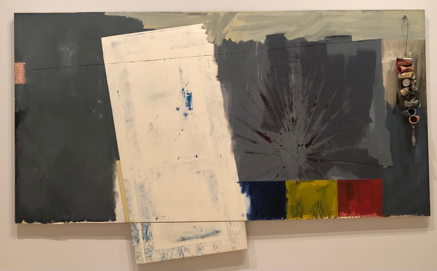
Other than New York, the two places that have most influenced Jasper Johns is his native South Carolina, addressed at the Whitney, and Japan, featured at the sister show at the Philadelphia Museum of Art. The South Carolina gallery is divided into works he created at a studio in Edisto Island in the 60s and work created years later in the 90s reflecting on his childhood in 1930s Columbia. He arrived in Edisto Island in the early 60s after breaking up with Rauschenberg, and the work from that time channels the beach as a place of loss and desire. Studio, the first Jasper Johns work purchased by the Whitney, reflects the sun and beach light after years of living in New York City. There is no clear subject matter here as there was in the previous gallery: instead we have the same luscious brushwork along with cans hanging on the canvas that we want to reach out and touch, the same way we might have wanted to touch the faces or lower the lid in the target work or run our fingers over the flag. There are direct impressions on the canvas made by a screen door that was painted with blue paint and pressed against the canvas as well as a palmetto frond from his yard that was painted red and pressed to the canvas along with studio detritus like beer cans used for mixing paint and used paint brushes. Johns probably got the idea of pressing objects onto a canvas from Rauschenberg, who saw it as a quick way to draw to scale in an impersonal way. Johns had thought he would get more work done away from the temptations and pressures of New York, but he actually found life in Edisto to be so relaxing and pleasant that he found himself working less. In 1966 the Edisto studio burned down while Johns was in Japan and he lost everything that was in the house, including his artwork and the artwork he owned by other artists. There are vitrines in the gallery with inventories drawn up for the insurance claims which give you an idea of what Johns had in the house. Johns never rebuilt the studio and returned to the northeast to live permanently: his beach house is now in Saint Martin.
Constellations: According to What

According to What, 1964
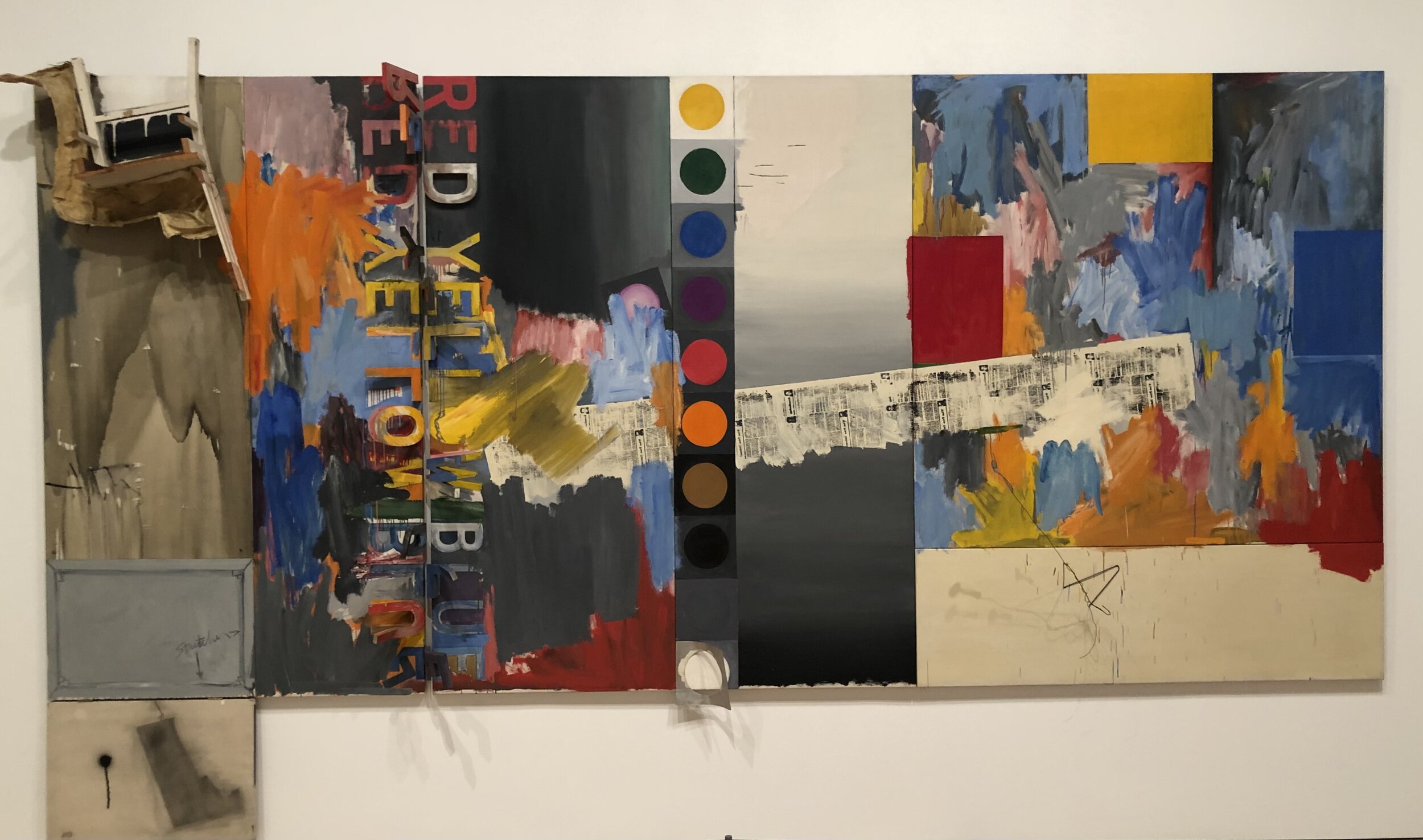
Until the early 60s Johns had focused on a single image, whether it be a target, a flag, a map, etc. in which the surface of the work was consistent throughout in terms of materials and palette. Johns considered paintings after this to be less “intellectual” and more focused on the materials and actions used to create them. Inspired by Rauschenberg’s Combines, the new work incorporated multiple pictorial spaces, materials, and styles. Rather than referencing common imagery recognizable to all, Johns began using imagery that had meaning to him personally which meant the meaning of his work necessarily became more enigmatic to viewers. According to What is an example of one of these works in which prior motifs and personal iconography are combined on multiple panels. In this case, the six panels measure seven by sixteen feet and are anchored compositionally and conceptually by the silhouette of Marcel Duchamp in the lower left, a copy of Duchamp’s Self Portrait in Profile. Duchamp’s use of readymades and incorporation of language became a lifelong inspiration for Johns. Johns discovered Duchamp after several reviewers labeled his work neo-Dada because they resembled Duchamp’s Dadaist use of readymades like urinals, snow shovels, and bottle racks. By signing a urinal Duchamp made a radical statement that something could be considered art if it was designated as such by an artist. By naming something as art, the artist emphasized the linguistic nature of naming an object. Johns and Rauschenberg went to Philadelphia to see Duchamp’s work in person in the Arensberg Collection at the Philadelphia Museum of Art. Duchamp was also interested in shadows, especially those cast by people, because they are a thing that exists in the world that is related to you, but is separate from you. This picture is full of shadows, including a spoon casting an actual shadow and a hanger casting a shadow that is actually drawn on the canvas by the artist. Johns combines found objects with two dimensional representation: the work includes a cast of a leg bent at the knee and a kitchen chair as well as a twisted coat hanger, metal swinging letters, painted circles of color that are reminiscent of color scales, expressive brushwork, silkscreened newsprint discussing the Kremlin and a hinged canvas with the profile of Marcel Duchamp. To a certain extent, Johns is asking more active participation from the viewer than he was when using an immediately recognizable image like a flag or a target: the viewer needs to interpret the meaning, decipher clues, expend mental effort, and invest time. The idea that a viewer completes the meaning of a work was central to Duchamp and inspired not only Johns but also colleagues in other artistic fields like John Cage and Merce Cunningham. Originally, Johns intended this work to be manipulated directly by the viewer, to move the letters spelling out Red, Yellow, and Blue on their hinges and to open and close the Duchamp silhouette. Johns returned to According to What repeatedly over time, revising the work as he came back to it during multiple viewings, incorporating imagery from previous work, read and painted words, printing, found objects, and abstraction. The work synthesizes previous work and points the way toward future directions. None of this ambition would have been possible without Leo Castelli, who we will discuss in the next gallery.
Display: Castelli, 1968

Harlem Light, 1967
While many artists of his generation saw integrating their work, both thematically and physically, into an architectural space as an integral part of their process, Johns has been more interested in creating work than how it is displayed in subsequent exhibitions. This retrospective was no different: Johns gave the curators the freedom to use whatever works they wanted in whatever way they wanted to display them. On two occasions while at Leo Castelli’s gallery, Johns was more actively involved in the display of his work. One of these shows is recreated at the Whitney, the other at the Philadelphia Museum of Art. Castelli’s gallery was located on the second floor of a townhouse at 4 East 77th Street in a relatively compact space measuring 25 x 21 feet with 12 foot ceilings. Shortly after founding his gallery in 1957, Leo Castelli met Johns while visiting Rauchenberg’s adjoining studio. Castelli offered Johns a solo show on the spot, and this sold out show in January of 1958 made him an instant star after previously only showing in small group exhibitions. The gallery at the Whitney reproduces the size and scope of a 1968 show at Castelli where the six works are tied together by the theme of industry and architecture. The dimensions of the gallery are the same as at Castelli’s, the ceiling height of the townhouse is marked off on the wall and the door is located in the same spot. The work in this Castelli show, produced between 1966 and 1968, consists of dark works hung vertically with a barely discernible image of a hanging spoon and fork with written instructions indicating that the fork should be reproduced “7” inches long. In referencing measurements and measuring instruments, Johns is interested in the idea of breaking space up into arbitrary units, seeing it as akin to mapping or creating a flag as a symbol for a country. The dark vertical works are offset by large horizontal works that are lighter and more visually varied with recurring motifs of imprints of a screen door, rulers, and multicolored impasto flagstones inspired by John’s memory of a wall he passed in Harlem while in a taxi on the way to the airport painted as if it were made of stones. When he went back to find the wall he couldn’t find it and concluded that it had been painted over so he recreated it from memory. We will take a break from obscure references to spoon sizes and things seen from speeding cars in a room full of prints displaying a more spontaneous sense of play.
Unique Prints: Savarin Monotypes

Savarin, 1982
Unlike many artists, Johns is not interested in printmaking as a means of making exact reproductions of an image. Often the creation of a print is only a preliminary step before Johns proceeds to alter it in a long series of “trial proofs” where he tries out the design using different papers and colors and “working proofs” which he sometimes alters by hand. Johns sees each iteration of a changing print as a finished work of art it in its own right and he has 2,400 of these proofs in his possession. Painting the same image multiple times requires planning and working entirely by hand while making multiple prints of an image is much less time consuming and allows a sense of creative play as ideas are easily assayed and assessed. He also began working with monotypes in 1978, which are one off prints made by painting or drawing directly onto a plate, often of plexiglass, which is then printed onto a sheet of paper. In 1982 he created thirty three of these monotypes in the Savarin series, inspired by his cast sculpture of a Savarin coffee can filled with paint brushes, which is generally considered a self portrait. Johns had created an edition of lithograph prints of the Savarin can but was unhappy with the paper it was printed on so over the course of four days he overlaid the rejected prints with monotypes. He applied ink directly to Plexiglas plates and then held them over the lithographs so that he could see where the ink would end up on the print below. The process gave Johns free rein to play with ideas on the fly, adding colors to crosshatches with his fingers, daubing the coffee cans with the tips of his fingers, or overlaying an oval vignette framing suggesting the Savarin can as a self portrait. Some of the monotypes are overlaid with what looks like stars but are actually the result of paint remover dripped on the ink. Two of the prints say “Hallelujah!” as Johns came to the end of the process, and the final monotype in the series came about by running a monotype through and then using the plate a second time to reverse the image mirrored in a more faded form. We will consider the mirroring of images by hand on canvas next.
Mind/Mirror

Spring, 1986
As Johns entered his 50s in the 1980s, he began producing work with highly personal references that allude to memories and nostalgia, intimate domestic spaces like his bathroom, his shadow, as well as personally resonate art history, including the work of Leonardo DaVinci, Matthias Grunewald, pieces Johns owns by Barnett Newman and George Ohr, popular images that play with the perception of the viewer, and a vase commemorating Queen Elizabeth II’s Silver Jubilee. Johns became interested in perceptual puzzles through Marcel Duchamp because they are in keeping with his interest in active looking, perceiving a flag or a map like you have never seen one before is similar to looking at a picture of a rabbit only to realize that it could also be the head of a duck. Johns finds it interesting that your mind doesn’t allow you so see both the rabbit and the duck simultaneously, which echoes the earlier challenge of seeing a painting of a flag and also a flag in and of itself at the same time. Vision consists of sensation and perception, there is the light on your retina but it takes your mind to perceive it and make sense of the image. This accretion of personal items is heightened by images seemingly tacked or taped onto the canvas. Works from this period are also often paired with identical or highly similar works painted with a different palette or with a different medium. Seasons pairs off Summer and Winter and Spring and Fall where the two seasons in question are depicted as closely related variants. The Whitney is showing Spring and Fall, Philadelphia got Summer and Winter. Both paintings feature Johns’ shadow that he had an assistant trace and cut out. Spring includes the shadow of a boy, which, placed below the shadow of the adult Johns, seems to indicate a reflection on childhood and aging. Lines slanting across the canvas suggest springtime rain and growth, as does the rabbit/duck perceptual puzzle familiar from childhood.

Fall, 1986

Racing Thoughts, 1983
Johns has always had an interest in presenting multiple versions of the same image, whether in color or in black and white as we saw with the map paintings, using encaustic or oil as with the flags, making a sculpture and using that as the basis of a print, etc. Racing Thoughts is shown here done in a colored encaustic with its attendant buildup of texture and then in a grisaille in a thin layer of oil. As with so many of his works, Racing Thoughts is replete with autobiographical and art historical references with the title suggesting an onrush of mental anxiety or creativity. Johns has described the process of painting as being a conversation with yourself as well as with other painters, and he incorporates the works of others as they come to mind in the creative process both as a way of paying tribute and a means of unsuccessfully exorcising them from his memory. Neuroscience has found that the creative process is closely tied to memory: that to be in the creative flow requires the prefrontal cortex to disengage from active problem solving in the immediate present so that the brain can begin making free floating associations which are inherently based on memories of past experiences.

Racing Thoughts, 1984
The setting is Johns’ bathtub: we see the running faucet and his clothing hanging on the wall evoking the flayed skin self portrait of Michelangelo in the Last Judgement segment of the Sistine Chapel. The wall has the outlines of an upside down figure from the Isenheim Alterpiece. A laundry hamper serves as a platform for a pot by ceramicist George Ohr and a vase with the profiles of Queen Elizabeth and Prince Philip from the Queen’s Silver Jubilee in 1977. There is a jigsaw puzzle of an old passport photo of Leo Castelli owned by Johns, a Barnett Newman lithograph and a reproduction of the Mona Lisa by Leonardo DaVinci, who Johns greatly admires. But as Johns relaxes in the tub reflecting on artists he admires, a man who made his career, and ceramics he enjoys owning, we have the memento mori of a sign warning of falling ice with a skull and crossbones. Daydreaming on the past continues in a more dreamlike way in the next gallery.
Dreams

Montez Singing, 1989
Moving from the crosshatches of the 70s and 80s, Johns began pursuing very different themes in the 80s and 90s that delve into the subconscious and irrational. The whimsy of dreams is represented at the Whitney, while the horror of nightmares, especially around the AIDS epidemic, are being shown in Philadelphia. Works in the “Dreams” gallery at the Whitney often feature a woman’s profile and her disembodied eyes from a Picasso painting, Straw Hat with Blue Leaves. Many works feature the precise outline of a form that has long been mysterious but was recently discovered to be an ancient sculpture called the Green Angel, although Johns refuses to confirm that as the source. In Montez Singing, the eyes and nose from the Picasso along with a pair of lips suggest the elements of a face regarding each other or a surreal landscape with the lips suggesting mountains, the nose a cloud and the eyes celestial orbs. The reference to Picasso is also a reference to perceptual challenges in line with duck/rabbit puzzles and seeing a crosshatch pattern briefly in a passing car. Picasso was exploring the ways we piece together knowledge of a face through the multiple angles in which we view it. Johns takes Picasso’s work and takes a more extreme step, wrenching out features like individual eyeballs and lips and placing them in a way that in no way resembles a human face. Wispy brush strokes along the edge suggest hair and the circles breasts. In the midst of these anatomical shapes Johns includes a simple picture of a sailboat seemingly hanging from a nail and wire. The sailboat and the title of the work, Montez Singing, refers to his step-grandmother who would play the piano and sing “Red Sails in the Sunset” when Johns lived in his grandfather’s house a boy. The large bulbous eyes and cartoon like nail are also a reference to Philip Guston, whose cartoon-like late work appealed to Johns as a mixture of melancholy and comedy. Johns has also expressed his interest in children’s drawings as being the purest origin of art, and the aesthetics of a child’s drawing is clear here. We have the textural, sculptural feel of the encaustic work: we will see actual sculptures in the next gallery.
Recent Sculptures

Numbers, 2007 (cast 2008)
This sculpture from 2007 seeks to replicate an older version commissioned by architect Philip Johnson in 1964 for the opening of the New York State Theater at the new Lincoln Center for the Performing Arts. The 1964 sculpture was made at a time when Johns was using number stencils and was created from sculp-metal, a metallic putty that air hardens into solid metal, a process reminiscent of encaustic where liquid wax hardens as it cools. The New York State Theater, now the David H. Koch Theater, is the home of the New York City Ballet and other dance troupes and Johns slyly referenced this by putting an impression of the foot of his friend Merce Cunningham at the upper right because he thought it would be a perfect way to get Cunningham’s foot in the door of the building where the New York City dance world would congregate. In 1999 Lincoln Center was going to sell the sculpture to raise money and Jasper Johns, Philip Johnson, and others protested because the work was made specifically for that space and is the only public work Johns has produced. Lincoln Center yielded to pressure and did not sell the sculpture, but Johns has noted that once they found out it was worth an estimated $15 million they decided to encase it in Plexiglass and cordon it off with ropes despite the fact that Johns purposely made it out of durable metal. With this experience in mind he asked if he could make a cast from the original but the owners refused so he decided to recreate the work from scratch “since I knew how.” Like flags and maps, numbers appeal to Johns as things the mind already knows that can be manipulated and reinterpreted in endless ways. Unlike maps and flags, numbers can be overlaid and naturally lend themselves to the idea of exponential growth and are free of any set scale or color. Once again, we have an example of a stunningly beautiful object with perfect texture and patina that we want to reach out and touch: there is a definite sensuality at play along with a sense of reassuring order as we vaguely perceive the arrangement of the numbers. As with the flag paintings, we are appreciating the aesthetics of numerals devoid of their meaning. Neuroscience has found that the appeal of visual arts is a close tie to the reading of texture: looking and touching, even if we do not have the ability to actually touch (think of the objects in a Dutch still life), we understand what we are seeing partly by understanding what we are seeing feels like as we run our hand over it. The 2007 sculpture was cast in wax and then into aluminum with the numbers going up sequentially starting from the upper left, where the first panel is left blank. For the 2007 edition Johns recast Cunningham’s foot. While a foundry handled the casting Johns added the polishing and patina himself. Johns used the now slightly damaged wax numbers left from the casting process to create the six smaller works in the gallery cast in bronze, aluminum, and silver. They can be displayed on a plinth as you see in the gallery or hung on a wall. There are keys embedded in the silver sculpture, probably a reference to those seeking to decode the myriad references in Johns’ work while the copper piece includes a prominent footprint and a classified ad for sex services and the bronze sculpture has impressions of a screen, echoing earlier work. In the final gallery we will return to works on canvas as Johns contemplates the end of a long life.
Elegies in Dark

Catenary (I Call to the Grave), 1998
In 1996-97 the Museum of Modern Art had a Jasper Johns retrospective and the experience of taking stock of his life and career as he approached his 70s seems to have spurred a change from the light hearted dream inspired works to work reflecting on mortality and loss in his Catenary series, named for the curve in strings suspended from two fixed points across the canvases. The paintings are encaustic and collage on canvas and almost entirely gray in tone, similar to works he created four decades earlier seen in the first gallery, but filled with an elegiac dignity instead of a more youthful angry despair. The fragility of the simple unadorned thread as it rises across the field of view suggests the arc of a life and its inherent vulnerability no matter how successful or seemingly secure. The title of Catenary (I Call to the Grave) quotes the Book of Job when the prophet contemplates death and suffering, wondering if the grave is the only end to his troubles. While the quote is from Job, the pronoun suggests Johns, whose signature is prominent on the canvas, calling to the grave himself. Ever since destroying early work he felt was too emotional when young, Johns has maintained an air of reserve, eschewing a celebrity artist life in the mold of his contemporary Andy Warhol. Here Johns expresses a quiet melancholy clouded in gray with barely discernible lettering quoting an obscure biblical passage like a quiet whisper that forces us to listen more carefully than something spoken in a louder tone.

Slice, 2020
Slice was completed during COVID-19 and is his most recent painting and embodies his penchant for incorporating elements that are designed by others, items that he takes readymade from the world around him and are, in a way he finds creatively compelling, not his. It features a drawing of the anatomy of a knee drawn by a 17 year old boy. The boy had torn his knee playing soccer and gave the drawing, based on an image he found on the internet, to the orthopedic surgeon treating him, who hung it in his office. Johns goes to the same orthopedist and liked the drawing enough to superimpose it on a 1986 star map called “Slice of the Universe” showing the distribution of nearby galazies sent to Johns by the astrophysicist Margaret Geller in 2018. Johns likes the image because the galaxies resemble a stick man in the middle. “Slice of the Universe” and the drawing of the knee are, in turn, superimposed over knot drawings by Leonardo da Vinci. Johns is therefore panning out from the viscera of an aching knee to the structure of the cosmos with knots created by an artist who seemed to balance the human and the cosmic more than any other before or since. Johns has said in recent interviews that over the past few decades he thought he was working on his final projects only to find that that was not the case. At 91 he knows that the final project is inevitably near at hand, but thankfully for all of us he will continue his creative engagement with the world around him until the end.

“…the past is beautiful because one never realizes an emotion at the time. It expands later, and thus we don’t have complete emotions about the present, only the past.” -Virginia Woolf
Themes in summary:
Intro: active looking is key to being fully alive/visual memory and the internal archaeology of images.
Target: repressed emotion in tension with emotional pain.
Flag: active looking and something the mind already knows/pre-Pop art and audience resistance to banal
Map: something you have seen repeatedly and think you know well but could not reproduce unaided.
Studio: beach life (Edisto Beach/Saint Martin vs New York)
Untitled: does knowing the source of a tracing alter understanding/appreciation
According to What: viewer completes meaning/abandoning recognizable objects demands more
Harlem Light: Castelli/measuring as naming
Savarin prints: creative play
Spring: Rabbit/duck and perception/mind can only see one at once
Racing Thoughts: artistic practice and memory/conversation with himself and other painters
Montez Singing: Picasso and perception of face echoes rabbit/duck puzzle
Numbers: Sensuality of touch
Catenary: Johns mortality and inscrutable grays reflect reluctance to play the art celebrity role.
Slice: taking what already exists and using it in a new context is creatively compelling.